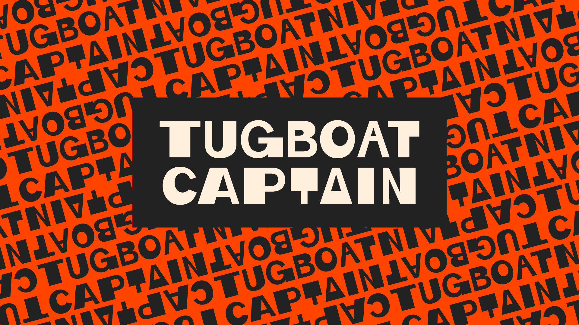
Battersea's finest band, Tugboat Captain, invited me to come aboard as their graphic designer in January 2019. In preparation for their biggest tour yet, a 20-date extravaganza from Truro to Glasgow, I was tasked with establishing a consistent look for the band.
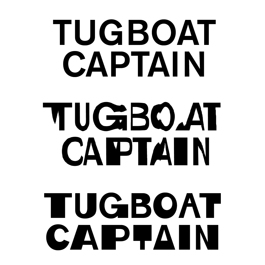
The process of developing the wordmark. First I picked a simple font (Akzidenz-Grotesk Medium), then experimented with nautical, wavy distortions in Photoshop. The idea was that the logo would be simple enough that it could be handmade, although I used Photoshop to try out concepts quicker. I didn't like the literalism of the distortion, but loved the tugboat-like stocky proportions that some of the letters picked up. I expanded that look to the whole wordmark, and then the whole alphabet, with stylistic alternates. I call the typeface Tugboat Akzidenz.
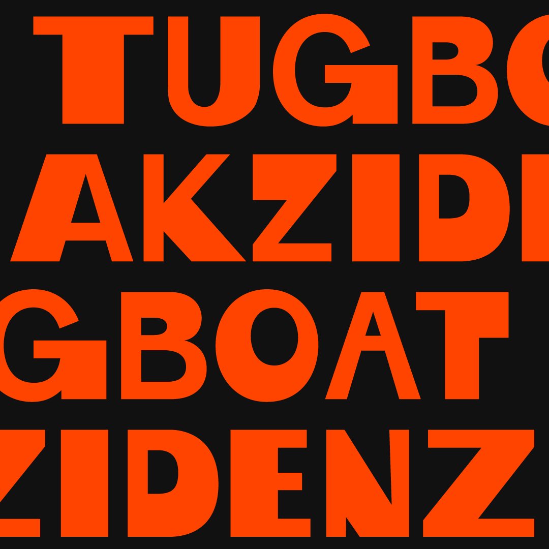
Tugboat Akzidenz, up close and personal.
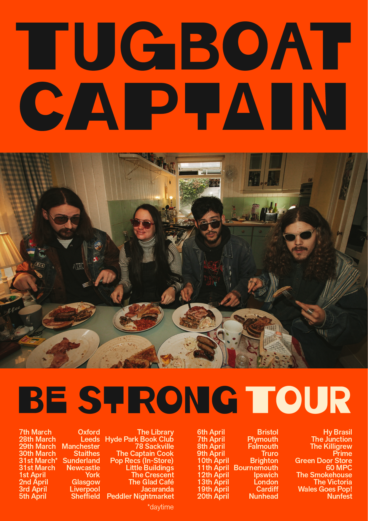
The poster for Tugboat Captain's Be Strong tour. That show at The Victoria was fantastic.
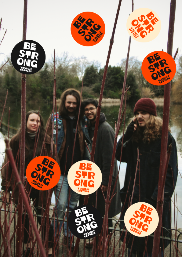
A slightly unnerving supporting image.
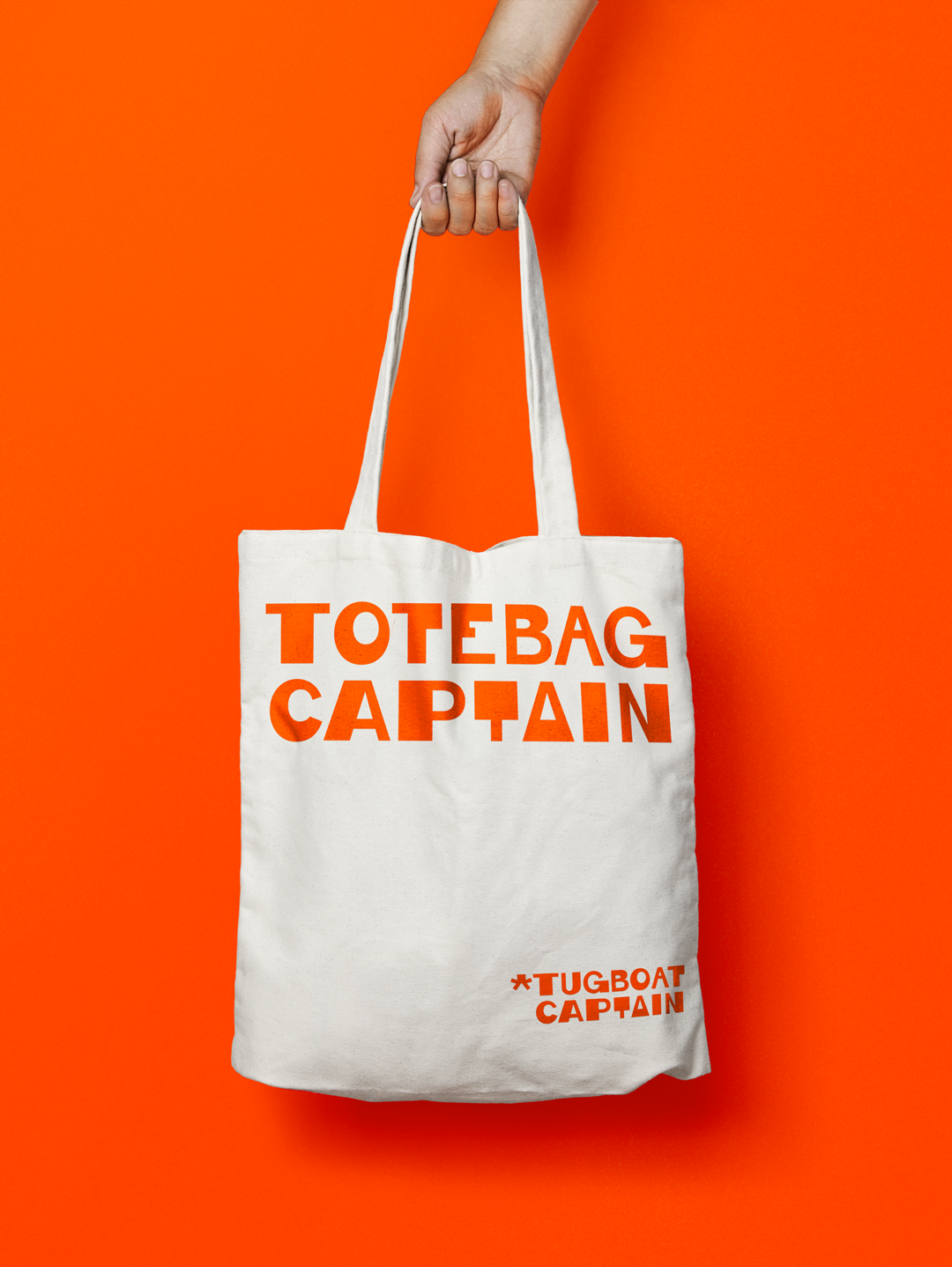
Part of the tour merchandise: a totebag. Indie fans love band totebags (I know, I am one). The range included tshirts, stickers, badges, wristbands, and – ironically – lighters featuring the 'Tugboat Captain' and 'Be Strong, Smoke less' typography.
A live video of a typically raucous Tugboat Captain performance.