I attended the Porto Design Summer School Editorial Course in the summer of 2017. The course, taught by Andrew Howard, Hamish Muir, Catherine Griffiths and David Pearson, consisted of lectures, design exercises, and one main project. The project centred around Italo Calvino's novel Invisible Cities, in which Marco Polo tells the Khan about fifty-five cities he has seen on his travels. The book has a fugue-like structure, with each of the eleven categories of city recurring through the book. Our class was split into two groups of eleven, each of which produced one edition of Invisible Cities. Each of us was assigned one category of city, and a different page size, so that the physical book could be as varied as the stories contained within. I was assigned the category of Trading Cities.
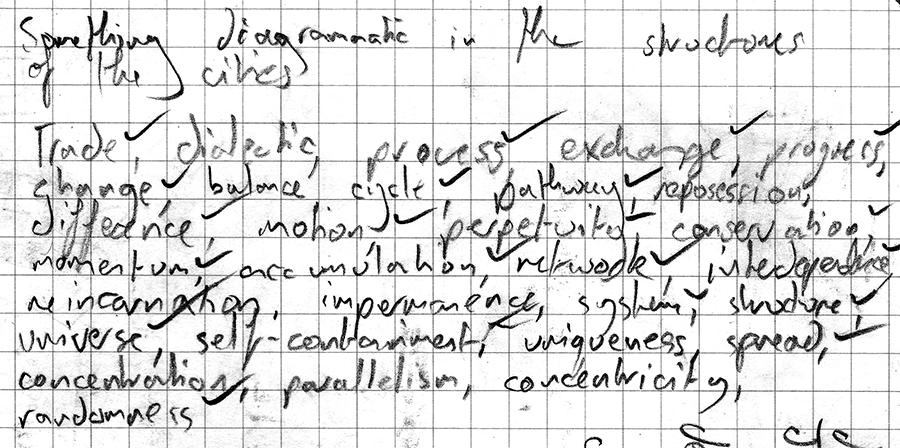
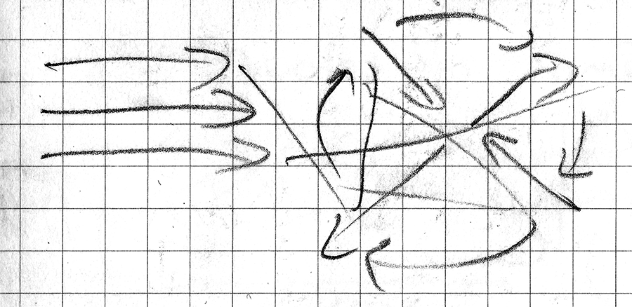
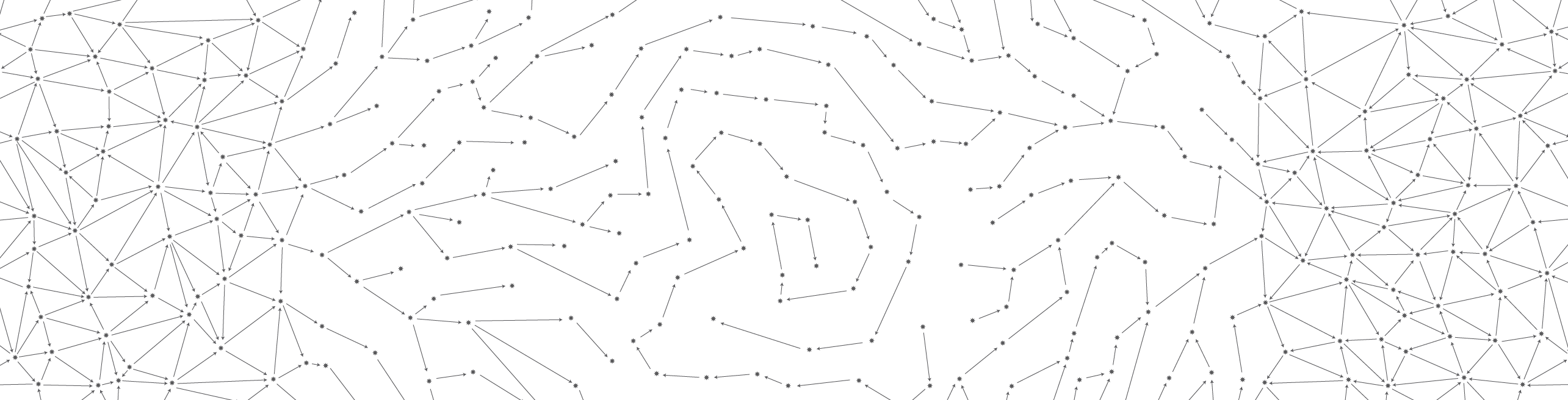
I realised that it was time for me to use the literary analysis skills I had learnt at university. As a literature student, I'm used to explaining books by writing essays, but this was design – I had to evoke, not explain. I wanted a meaningful design centred in the text. I took myself away to a café in the local square and read the stories over and over, listing all the themes and feelings they contained, and highlighting the crucial ones I wanted to convey in the design. Polo describes the social and economic interactions of the cities, and I was struck by how each one is subtly different. I found myself wanting to express the directions of interactions diagramatically – the first was progressive, the next divergent, the next cyclical, the next convergent, and the last reciprocal. Drawing out these diagrams, I realised I had found the visual expression of the stories I wanted. Following the themes of navigation and wonder in the novel, I decided to express the diagrams as star charts, with 55 stars per page in a nod to the overall structure of the book.
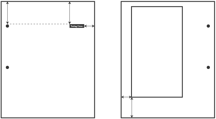
I took the parameters of the brief as inspirations instead of restrictions. Because the page size and binding had been specified, I let them define the position of the titles and text area. The book could be taken apart, and I wanted to give the reader a reason why it should be. I made each of the star charts flow into the next (and the last into the first), so that the pages could be reunited and assembled like a puzzle.
The ultimate parameter in any brief is the user, and I took a UX-inspired approach to this design. The outside and bottom margins were defined by the size of an average thumb and hand (well, of my hand). As well as letting the reader's comfort guide the design, however, I also designed in some discomfort to guide the reader. Because all of the stories were so short, they could fit on one page, and are best read in a quick burst. To this end, I put all of the text on the verso pages, forcing the reader to hold the page open to read the story. This also led my decision to use a thin card for the pages – to provide a little page-turning resistance. Otherwise, the text was set as conventionally as possible.
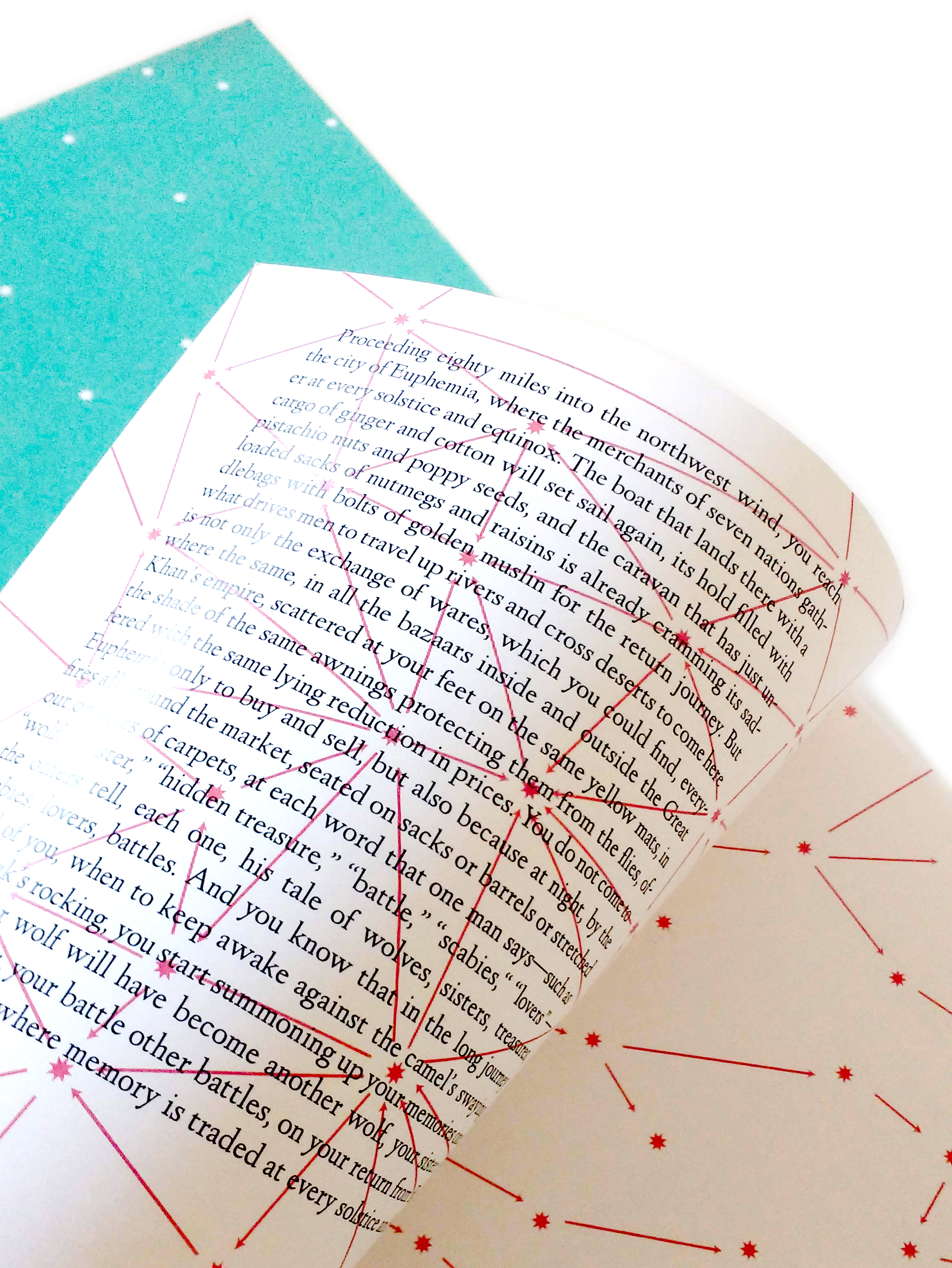
In a classic printer mishap, I accidentally printed the body text on the illustration side of the paper – and I had to keep it. In the final product, the black and red were printed in separate passes to preserve something of the randomness that birthed the idea.
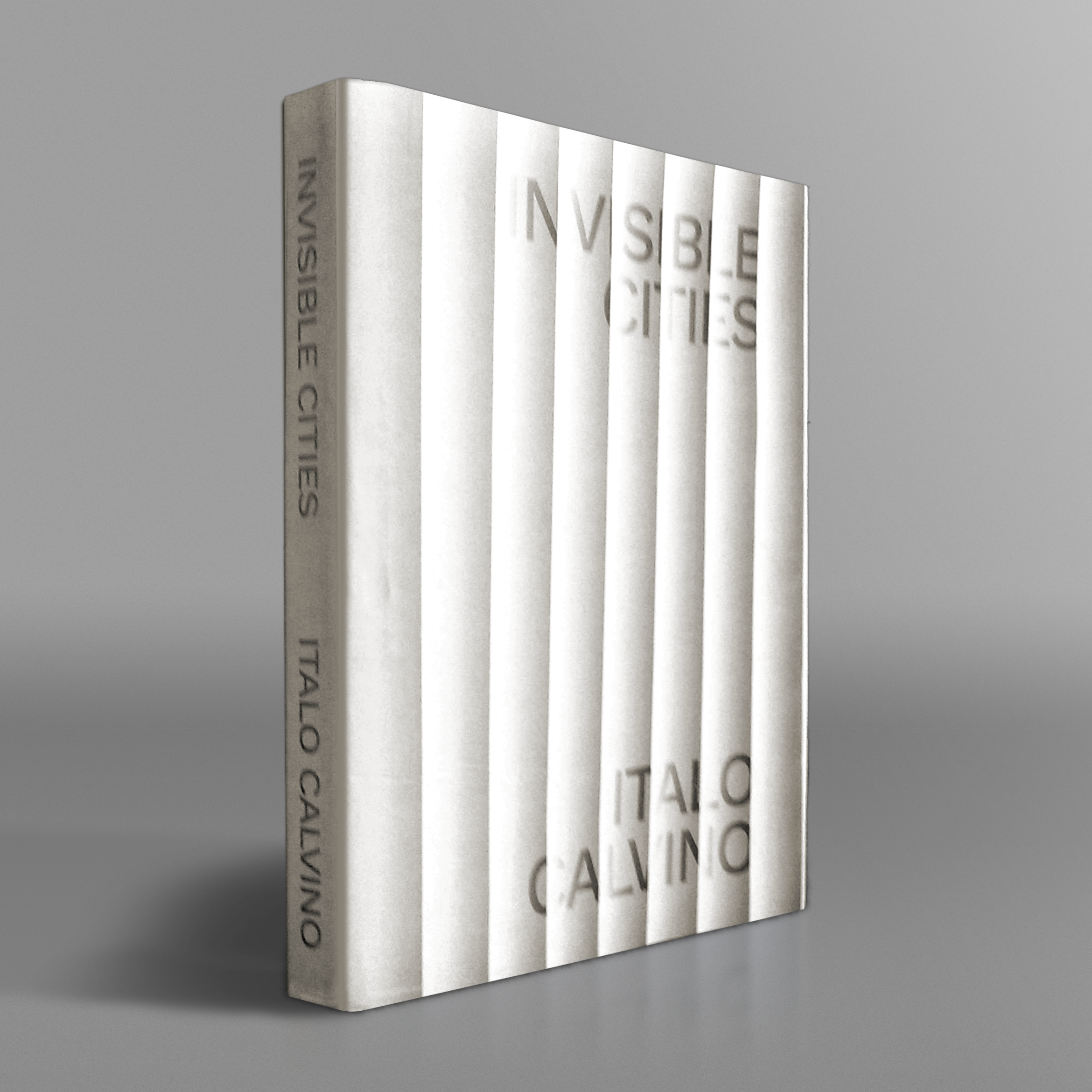
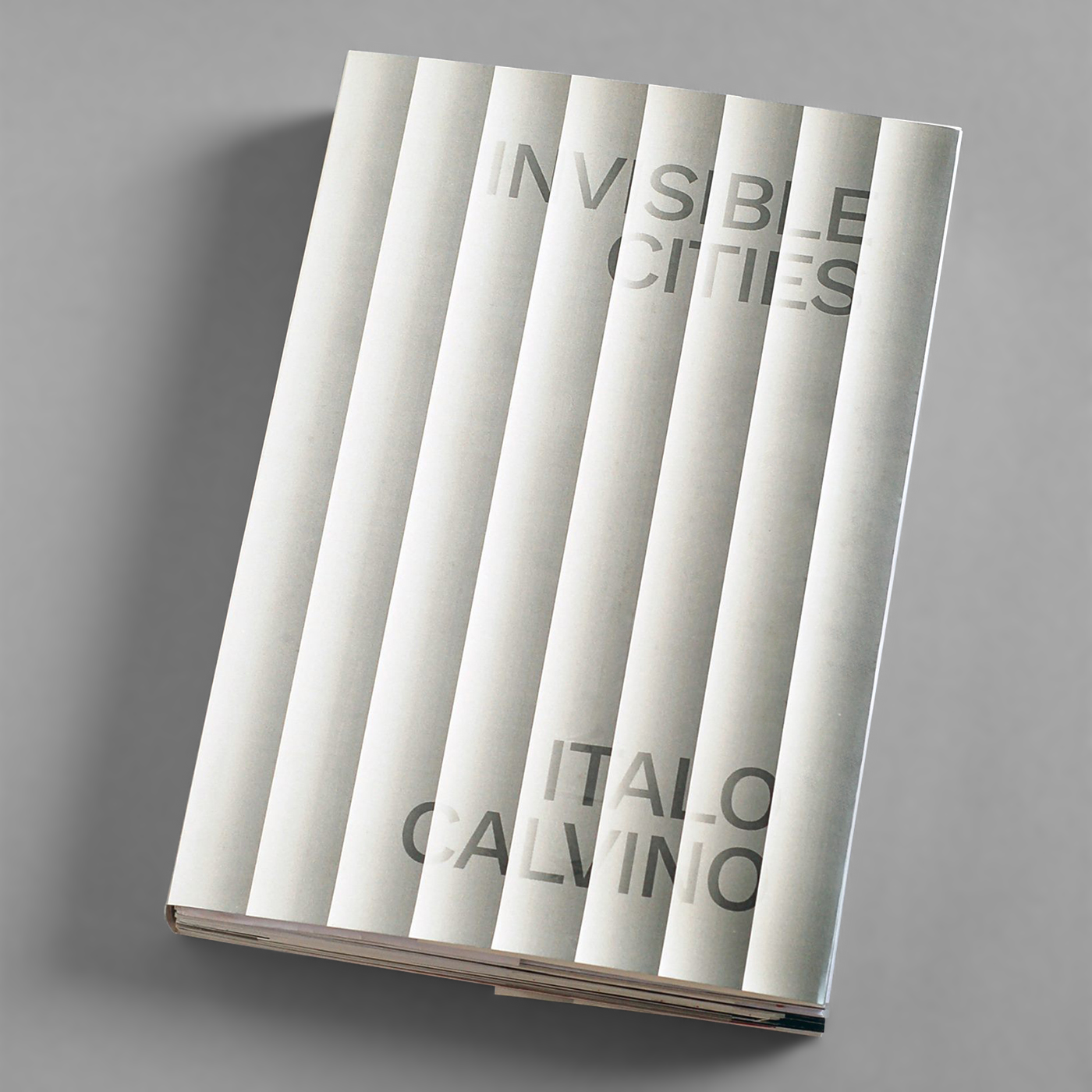
For the dust jacket, I wanted something simpler and bolder – and, honestly, something with a shorter lead time. In trying to give a sense of shimmering invisibility to the type, I overlaid it with bars of gradient – and the bars looked better than the plain background. It was only on printing out and trying on the dust jacket that its trompe-l'oeil effect became clear: it looked unbelievably like a fluted column. Classical, architectural and kind of magical – I didn't need to do anything else to evoke Invisible Cities.