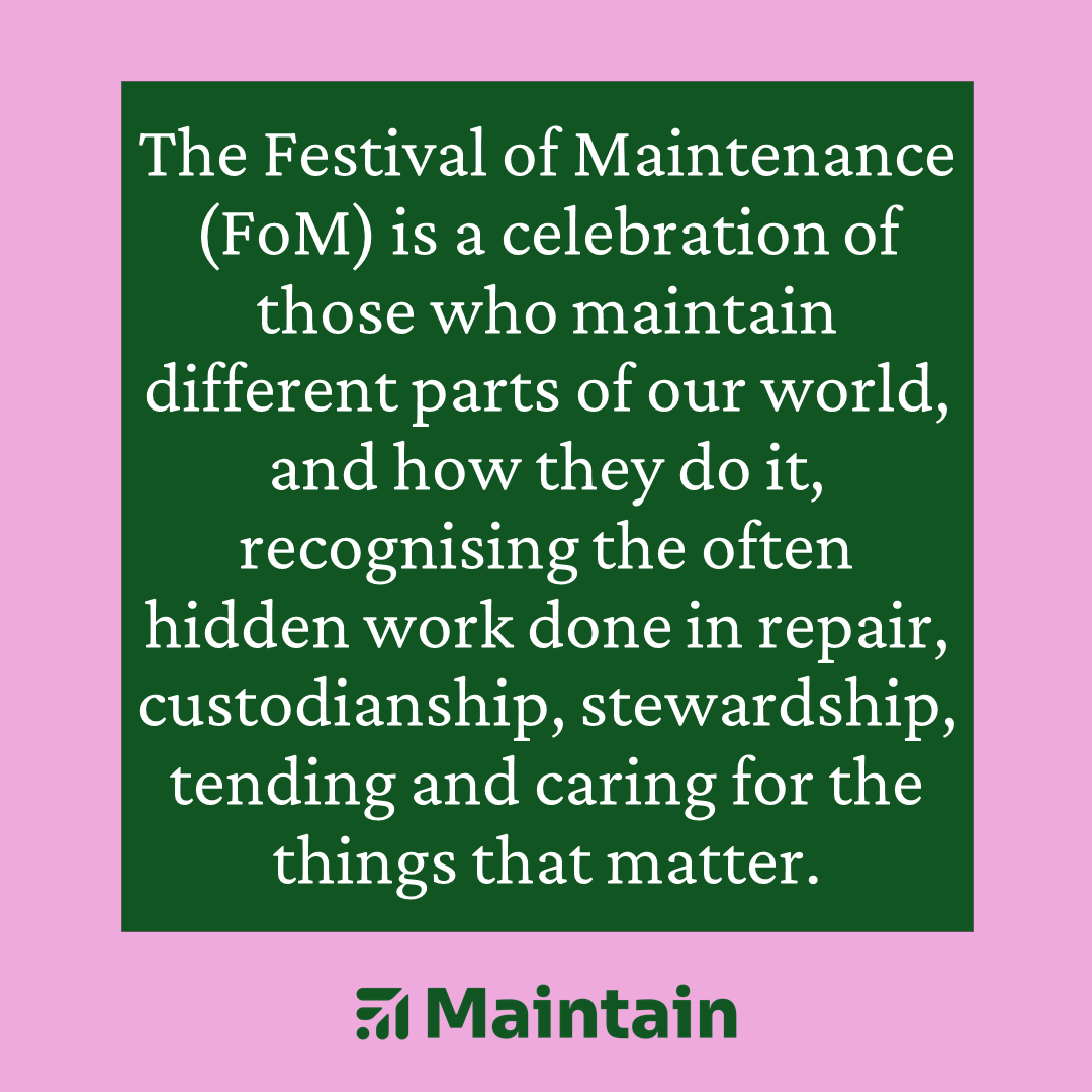
Maintain, formerly the Festival of Maintenance, is a community of people interested in maintaining different parts of our world. I was selected after a public call for a graphic designer. Maintain wanted their brand to avoid any clichés or literal visual metaphors – so no tools and no faceless representations of people. It was also important for the the brand to follow the principles of Maintain as an organisation. For this reason, I chose two open-source typefaces: Sora and Crimson Pro. The icon grew from a monogram for the Festival of Maintenance into a symbol that evokes the dynamic solidity and progressive collaboration that characterises maintenance as a principle.
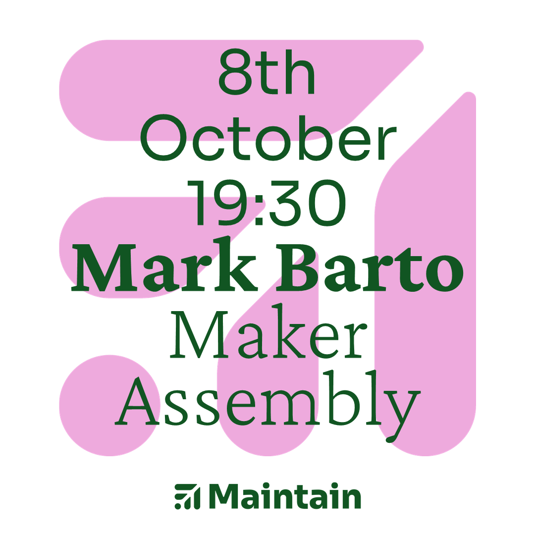
To keep things as easy as possible to use, edit and share, I made sure that all of Maintain’s social media assets could be edited on Google Drive by anyone in the Maintain team.
Maintain’s Laura James wrote an article about the branding process here.